
According to BusinessKorea, Hyundai accounts for 8.9% of the U.S. market share. Hyundai offers BlueLink as a companion app to their vehicles but the adoption of the service among vehicle owners is much less compared to other companion apps provided by the other manufacturers. The objective of this project was to uncover some of the underlying problems and provide recommendations along with a proof of concept to the Hyundai stakeholders.
This project was undertaken as part of classwork for industry partners.
Problem
User adoption of BlueLink - the companion mobile app for Hyundai Electric vehicle was low. Users had unmet needs and frustration with the features in the app
Solution
We discovered and designed features to fix the UX debt to close the gap between user expectation and product features.
Project Team
Dave M.R. - Senior UX Engineer, Hyundai Motors, Industry Client
Prof. Russ Branaghan - Associate Professor, Human Systems Engineering, Mentor
Human-factors: Christina Lewis, Kasey Stevenson, Klariz Gapusan
User Experience: Venkatesh Lakshmi Narayanan
Tools Used
Pen & paper, sticky notes, Adobe Xd, Adobe Photoshop
My Role
UX designer (research, ux, ui prototyping & visual design)
Duration
5 weeks
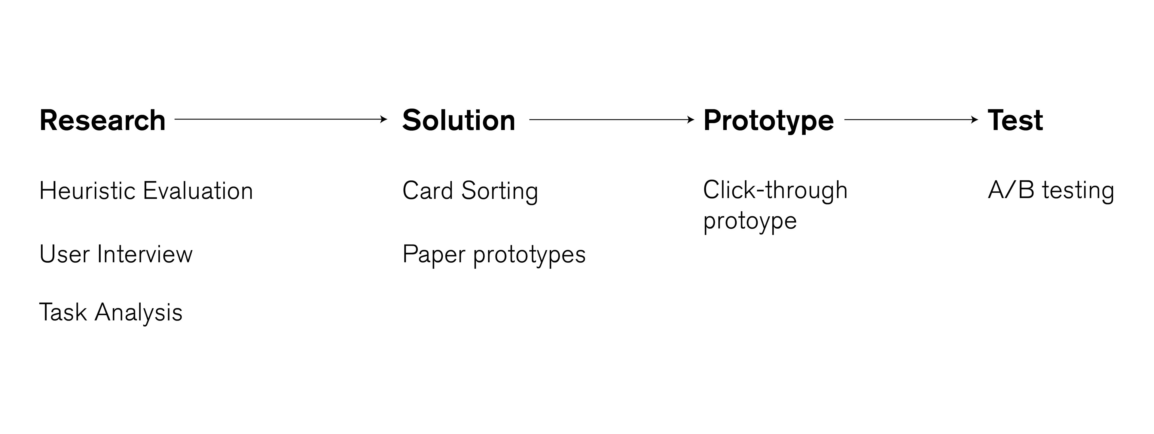
The Process
How do we help Hyundai vehicle owners recognize the convenience of the app, and improve the experience for drivers?
Since the project duration was 5 weeks, the deliverable was a primitive click through prototype which demonstrates the new task flow suggested.
Heuristic & Task Analysis
We asked volunteers to perform basic tasks on the app and collected feedback. We also conducted heuristic analysis to check if the app functions as a user might expect it to and find issues in existing UI.
User research
We got a brief from our stakeholder based on which we did a quick guerilla research to gain insights on the motivation and frustration of the existing mobile app. We did an impromptu survey on the pseudo users to get feedback.

Competitor analysis and Feedback from actual users
Due to limited access to actual Hyundai EV and its users, we collected feedback from the app store to get a better idea on the critical issues to be addressed.
We also compared the UI and affordability other apps offer to users to find the gap and needs of the user.
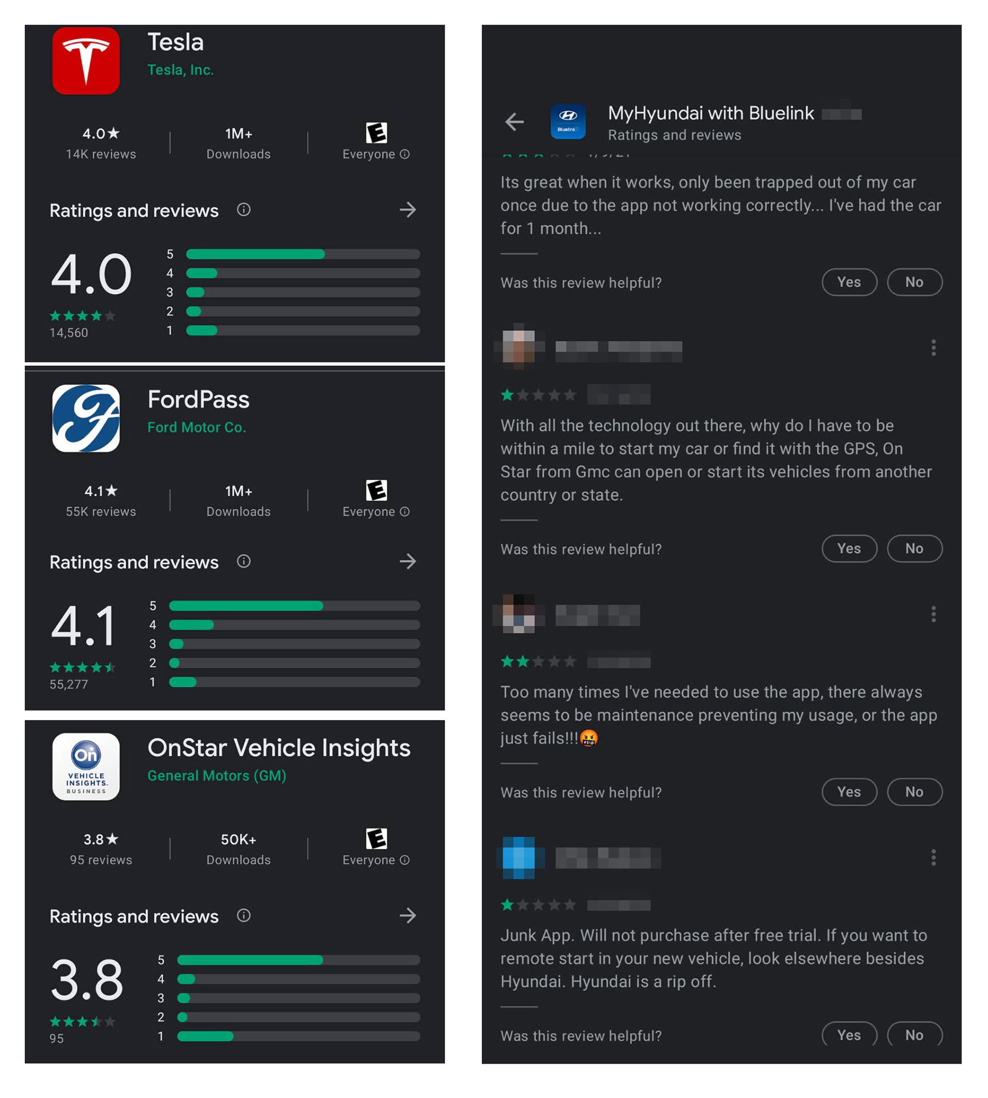
"The premium app serves only as a basic key fob and task scheduler, which is not something I would pay for. Even those functions don't work most of the time"
- Mihai, test participant
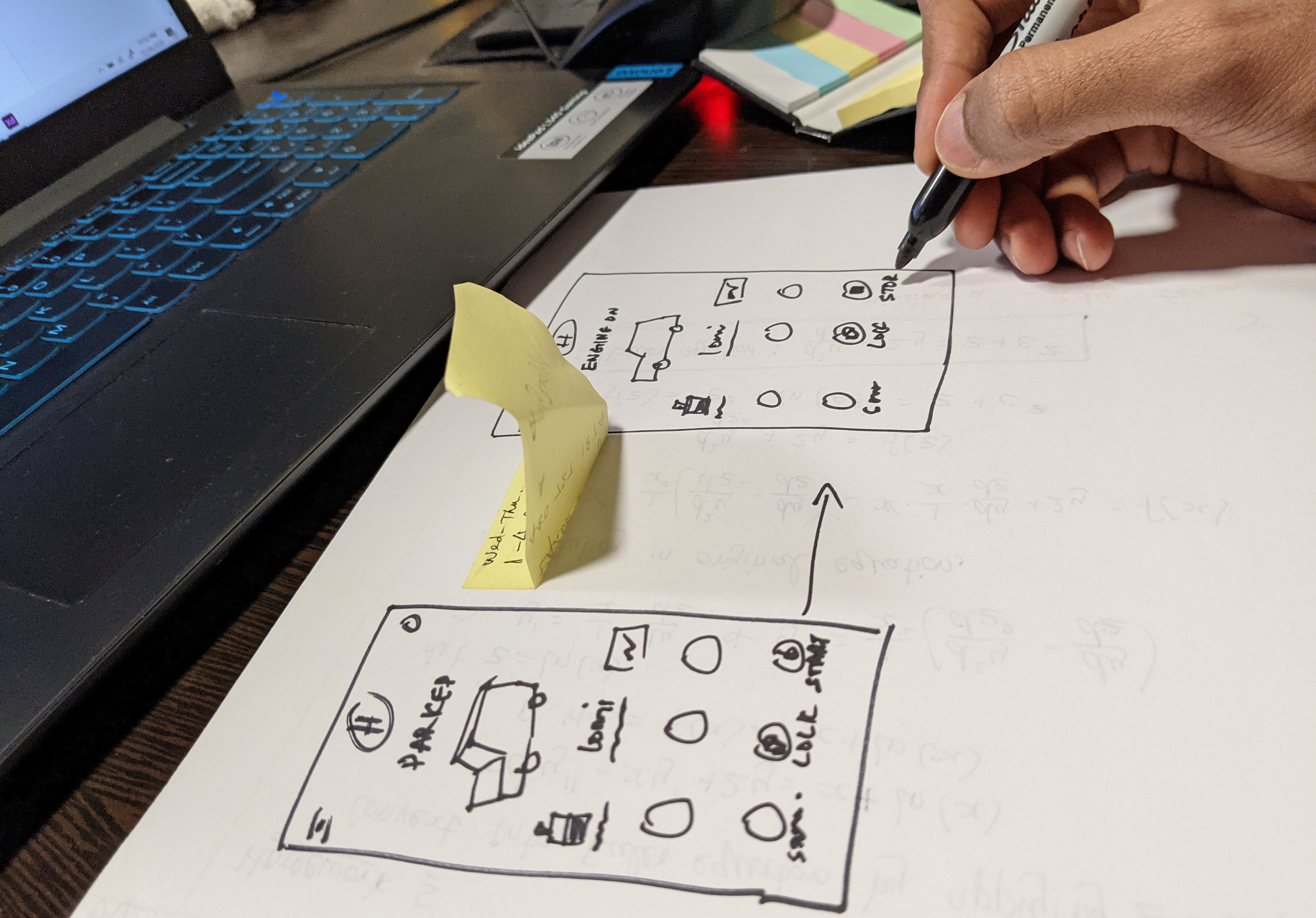
Framing the problem & Building the prototype
Based on research outcomes from previous steps, we framed 3 problems to limit our scope. Due to the duration of the project we intended to solve only these 3 problems using our proposed solution derived by brainstorming ideas, card sorting and paper prototypes. Finally we converted the paper prototypes into interactive one using Adobe Xd.
The problems chosen were :
Fix - performance of basic key fob functions: start/stop, adjust lights etc.
Improve - Identify current status of vehicle: start/stop, temperature control, battery percentage.
Meet basic needs - Elicit response to find aspirational, ideal and must-have functions that are missing.
Fix - performance of basic key fob functions: start/stop, adjust lights etc.
Improve - Identify current status of vehicle: start/stop, temperature control, battery percentage.
Meet basic needs - Elicit response to find aspirational, ideal and must-have functions that are missing.

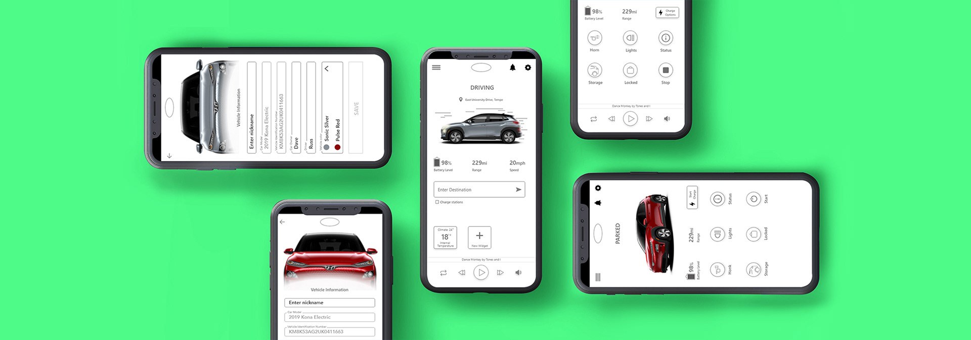
The Solution
Adapting to User's context
The existing interface is very static, displaying the same set of options despite the changing needs of the user during different phases of app usage. Fixing this would mean users are provided with meaningful options at every phase of the journey
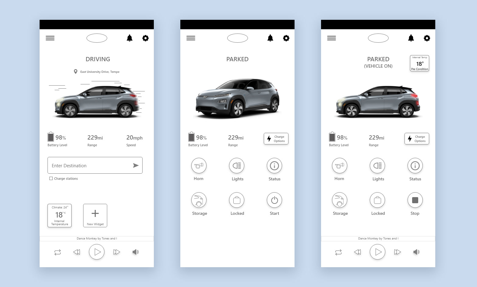
Interactive UI: Fixing Static Imagery
The image of the car takes a third of the entire screen but offers nothing in terms of usability in the existing interface. The static image conveys brand image nothing more than that. Fixing this can bridge the gap of users' mental intangibility by serving as an interactive progress indicators.

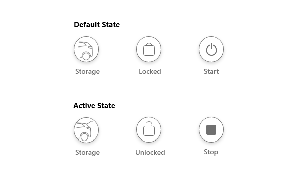
Keeping user informed: fixing the static buttons
The buttons used in the interface don't inform users of the current state or the status change after initiating critical tasks; example: the start/stop button offers no context to users about the current state of the vehicle in the existing interface. Fixing this would make the buttons behave like status indicators without the need of additional feedback.
Infotainment Control Integration
The existing interface doesn't take into account the need of the user to control their infotainment system remotely. Infotainment control is one of the highly performed tasks in a vehicle, this includes controlling entertainment and navigation which often requires integration to 3rd party apps. While users are unlikely to switch to new services from Hyundai, providing users with options to launch and control existing navigation & music services from within the Bluelink app could be critical in making it more usable. This will also transform the app to double up as in-vehicle remote for the other passengers in the car to remotely access and control the infotainment system.

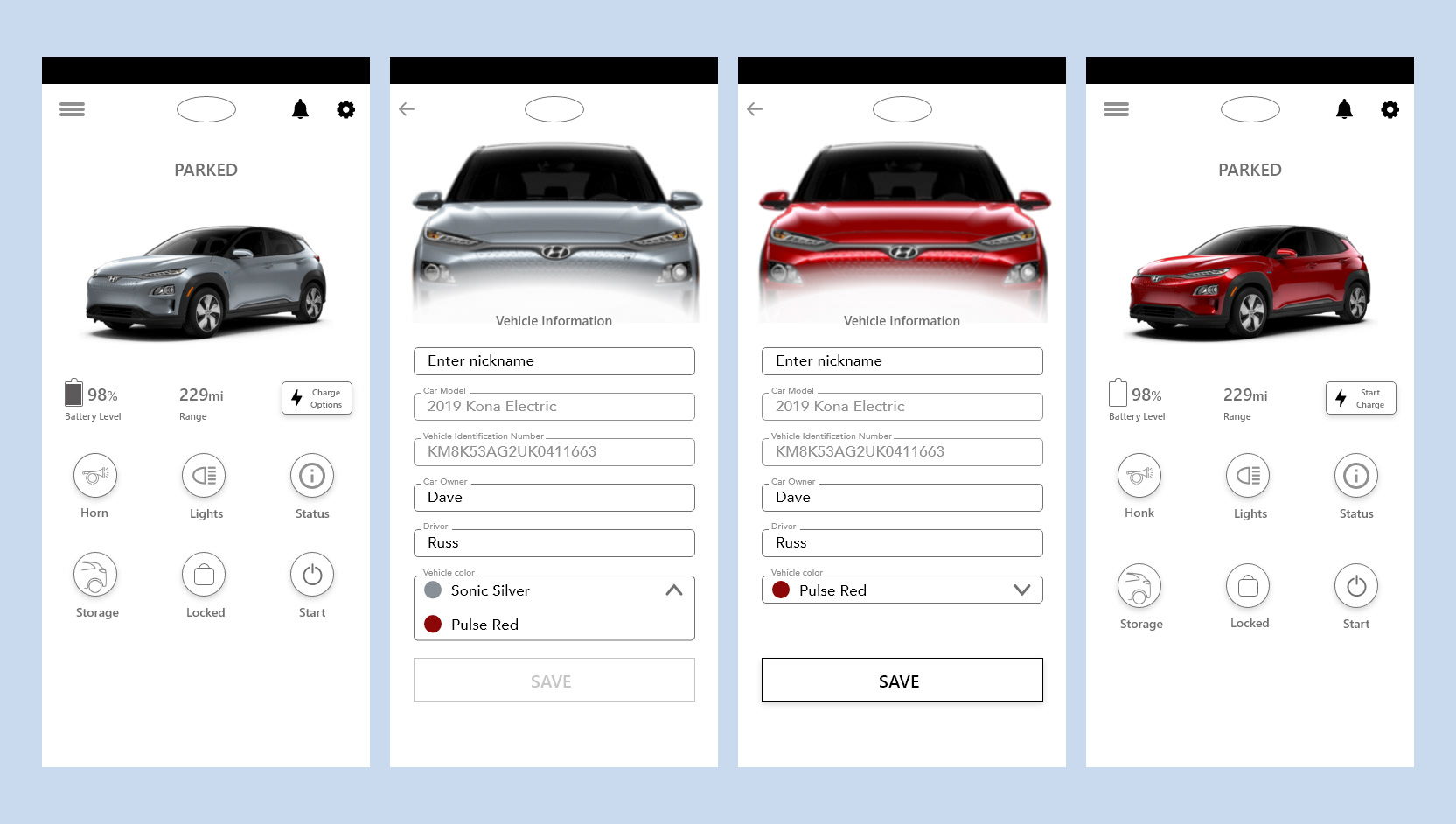
Happiness in little things
The existing interface displays the car in its generic color and not truly reflecting the vehicle it is connected to. While this seems to be a simple issue, all the users interviewed expressed their dissatisfaction with this. To fix this, as an intermediate solution we provided an option for users to change the color themselves to closely resemble their vehicles but on the longer run we would expect this vehicle data to be pulled from a database during the initial setup.
Results
A/B test & qualitative feedback from participants
To assess the effectiveness of the new design, we tested the prototype along with the original app. Randomly selected participants were asked to perform the same tasks in both the original and new interface. The order of presentation was varied to counter the learning effect. Additionally qualitative feedback was collected on new features as we didn't have benchmark metrics to compare the results with.
Both the original and new design had 100% success rate but the new design had on avg. 3x improvement in time taken to complete task.
The satisfaction rate on tasks performed were assessed using a Likert scale based questionnaire, it showed significant improvement with 100% users satisfied (feeling confident, ease of learning & capabilities matching their need) comparted to 33% for the original design.
One area for improvement found was that users expected the option of searching destination to also show up in Parked (vehicle-on) mode too.
Stakeholder feedback
Dave, our industry stakeholder from Hyundai was impressed with the quality of the proof of concept. Few of the highlights from the feedback were :
- Using existing assets from website to make the vehicle imagery into progress indicators was found to be an innovative and feasible solution that would improve the desirability of the Bluelink app.
- Providing short-term and long-term solutions to the vehicle-color issue was found to be very professional, as product managers in a real-world scenario would expect the same.
- While the idea of a dynamic interface was promising, stowing away options under modes may be confusing for the older user demography. Since we designed and tested the interface for younger adults this was found to be an acceptable & innovative solution for information hierarchy problem.
Future Prospects
Due to the short span of the project, we didn't explore much into color schemes which was one of the issues found in early research. If provided the opportunity I would test the prototype further using users who represent the market segment the app/vehicle is targeted at. While the app re-design was fulfilling as we had the opportunity to research the original app paired to an actual car, the prototype was a make-believe without any real-world consequences. It would be interesting to see how lag between action and result plays out. I also imagine that in real-world there would be resistance to design changes especially in siloed teams, it would be interesting to explore other metrics that might be required to advocate design changes.


