SolarSPELL: Digital library redesign
Background
SolarSPELL is a digital educational library powered by a solar panel. These devices are deployed in remote communities around the world which have limited internet connectivity to bridge the gap of accessibility to good educational resources. SolarSPELL started with the aim to provide educational resources to K-12 students with a focus on primary grades. In 2019, they started the next step in their journey to provide quality resources to adult learners with libraries for specialized domains, starting with a medical library for the School of Nursing and Midwifery at Juba, South Sudan. In an effort to meet the user expectation and needs of adult learners they decided to redesign the interface to improve the overall user experience.
Problem
The digital library was initially designed for guided use by kids in the presence of a trained teacher, but adults require options for free exploration to find the resource they need quickly and easily, without any additional help.
Solution
Designed an updated interface that allows free exploration by improving search function, adding new features that make finding similar content easy and satisfy the needs of an adult user. The new interface is also complaint to WCAG guidelines for improved accessibility.
My Role
UX designer (research, UX, UI & visual design)
Tools
Adobe Xd, Illustrator, Photoshop, Figma, Google Suite
Method
Content inventory audit, Stakeholder interview, Secondary research, Heuristic evaluation, User research, User persona & stories, Expert analysis, Journey Mapping, Wireframe, Rapid prototyping, UI design, Usability testing
Technical limitations
The entire library was hosted from a micro-SD card using a Raspberry-Pi microcontroller, so the design also had to be easily implementable. Focus was on factors with minimal change yielding maximum user satisfaction.
Partners
I worked with library specialists, a development team and a project manager at SolarSPELL
PROCESS
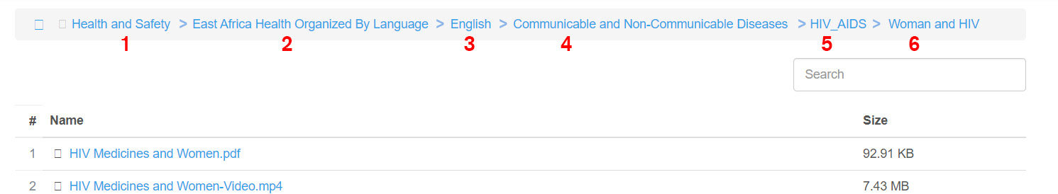
Content Inventory Audit
After evaluating the existing inventory we found four major flaws in the existing information architecture, which are listed below
- Complex content hierarchy: Content buried under too much categorization
- Content classification issues: similar content under different sections
- Content discovery issue: Limited search capabilities
- Broken links/ Empty pages
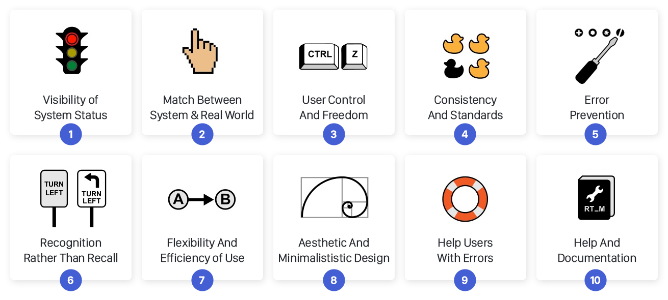
Heuristic Evaluation
After evaluating the library with the 10 Usability Heuristics provided by NN/g, we found the following issues in the UI design
- The contrast of the colors used did not adhere WCAG guidelines
- Click-area larger than components
- Search did not include results from sub-folders and users were not aware of it.
- Reaching certain content seemed impossible due to limited search or too many clicks.
- Download button was not easily accessible. (especially for the videos)
- There was no way to discover similar content across the different sections
User Survey Insights
We used a user-survey to understand the motivation and frustration of our new user group and gain insights to focus our efforts on. The survey was conducted with 14 users representing our actual target group. Participants rated their experience of using the existing library on a 5 point scale. Usability issues and frustration of finding content emerged as top issues. Getting additional information on a specific topic was the major user goal.

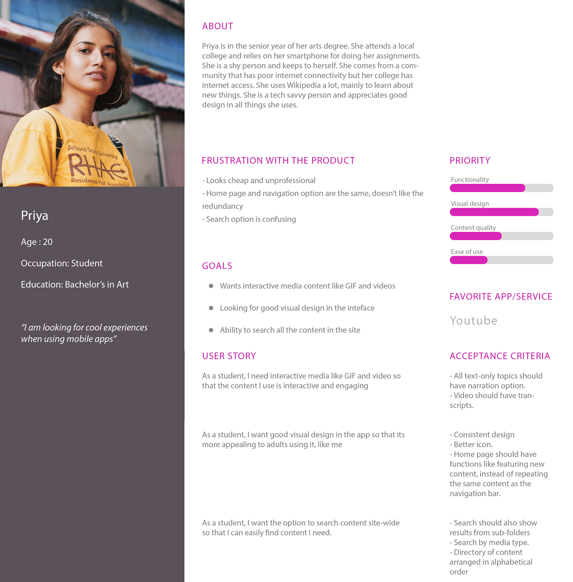
User Persona & Stories
We created two personas, one for the student and one for the teacher/ peace-corp volunteer. They represent the two major user groups who will be using the library. Their stories were reflecting the motivation and frustration uncovered in earlier stages.
Usability test (benchmark)
Five participants performed six tasks which would satisfy the need stated on the user story, their time on task and satisfaction scores on a 5 point Likert scale were recorded. This would be the benchmark to test the performance of the prototype to be designed.
Based on the pattern found in feedback, the top issues to be addressed were:
- The download option is hidden
- Search doesn't function as intended
- Content hard to find, navigation bar and landing page were similar
- Difficult to find content of a particular type.
- Search doesn't function as intended
- Content hard to find, navigation bar and landing page were similar
- Difficult to find content of a particular type.

Secondary research: Expert interview
This specialized library was focused on nursing so I got opinions from medical practitioners on a few of the solutions I had. Two of the ideas stood out
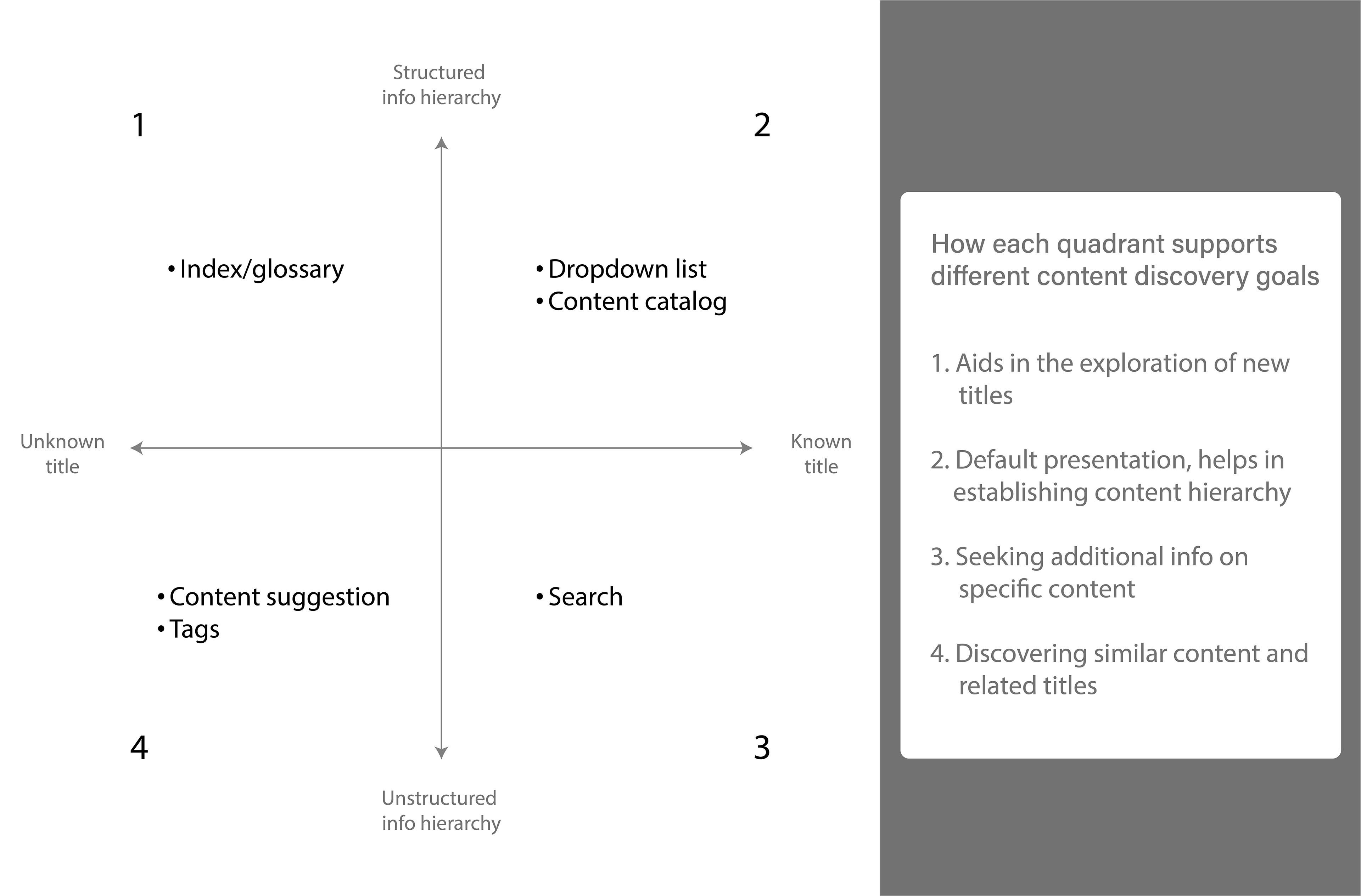
(1) Directory or keyword index to find related content across different titles
(2) Include short description of page & content in list so that users know what to expect
(2) Include short description of page & content in list so that users know what to expect
The reason these ideas were selected over others is that they had a strong human factor basis
(1) Familiarity of searching index for keywords in medical journals & at the end of text books
(2) Solving ambiguity, discrepancy of misidentification of topics by having short descriptions.
(2) Solving ambiguity, discrepancy of misidentification of topics by having short descriptions.

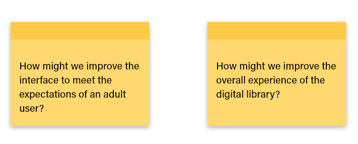
Brainstorming Ideas: How-Might-We exercise
Based on a quick brainstorming exercise and HMW exercise I listed a few possible ideas to fix the problems uncovered
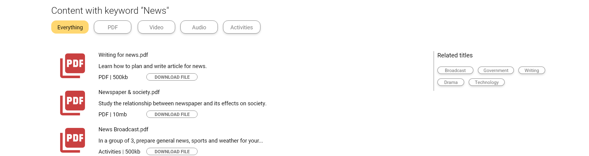
- Implement global site-wide search
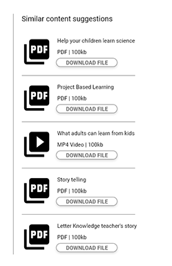
- Include content tag and hyperlink to discover similar content
- Navigation bar should have drop down for submenu
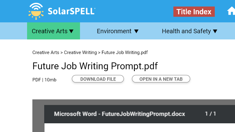
- Download option should be visible and easily accessible
- Option to download multiple files and folders
- Video should have description and run-time in the index
- Directory or keyword index to find related content across different title
- Include short description of page & content in list so that users know what to expect
- Increase the preview window size of PDF document viewer
- Include content tag and hyperlink to discover similar content
- Navigation bar should have drop down for submenu
- Download option should be visible and easily accessible
- Option to download multiple files and folders
- Video should have description and run-time in the index
- Directory or keyword index to find related content across different title
- Include short description of page & content in list so that users know what to expect
- Increase the preview window size of PDF document viewer
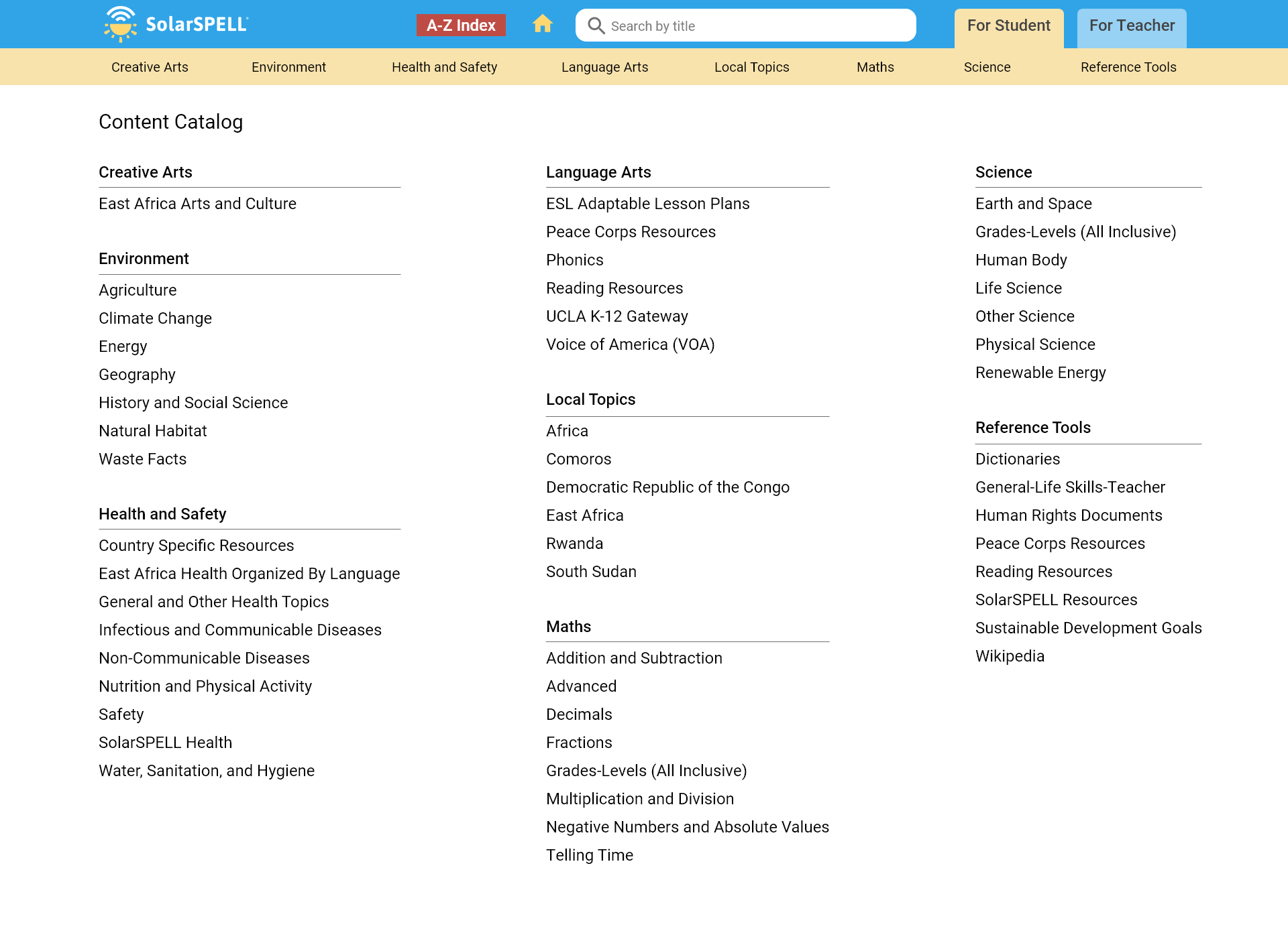
Rapid Prototyping
Combining the knowledge of the existing design, user preferences for educational content and insights from the research & testing, I came up with quick sketches which I made into a clickable prototype for testing.
The major changes include
(1) improving the contrast of colors used
(2) separating teacher and student content
(3) displaying topics and sub header upfront to reduce number of clicks
(4) including a global search bar
(5) introducing a new index feature, with all the content tags in the library listed out.
(2) separating teacher and student content
(3) displaying topics and sub header upfront to reduce number of clicks
(4) including a global search bar
(5) introducing a new index feature, with all the content tags in the library listed out.
Usability testing (evaluating prototyping)
Due to pandemic restrictions, we were only able to test the interface with two users. We were able to gain an average of 3x improvement for the time on task for 5 of the tasks. One of the tasks had poor performance due to a labeling issue, which we fixed after the test.
We also had a full 5 point rating on first impression and experience after performing the tasks. All the new features were well received by the test users.
We also achieved the target of accessing any content under 3 clicks, down from a maximum of 7 clicks.

Interactive Prototype
The interactive prototype used for the usability test was built for desktop devices on Adobe Xd.
Stakeholder Feedback
After presenting the prototype to the stakeholders, I got a lot of appreciation and feedback from the team. This one stood out the most
"Thanks Venkatesh! I really enjoyed your presentation yesterday. I actually used SolarSPELL in the field at my primary school as a Peace Corps Volunteer, and a lot of your recommendations for the Juba library could be similarly applied to the one my school had. It's exciting to see the 'behind the scenes' work that goes into making these, so thank you!"
- Courtney Finkbeiner, the Student Engagement Coordinator at SolarSPELL
My contribution also got appreciated in a post featured across their social media page on Facebook, Instagram and LinkedIn.

This was recognized as the best student project in Fall 2020


